

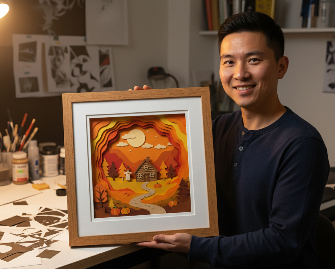
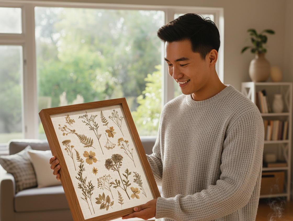
Best Frame Styles for Different Room Designs (Modern, Traditional & Transit)
Frames are furniture at eye level. The profile, finish, and scale you choose communicate just as much as the art inside. Use this room-by-room primer to narrow hundreds of mouldings to a shortlist—then preview your finalists online.
Living rooms: social lighting, flexible styles
Living rooms mix overhead cans, windows, and lamps—reflection management matters as much as profile. Design moves that work:
- Warm wood tones with restrained grain for traditional and transitional homes.
- Narrow flat metals (matte black, brass, brushed nickel) for modern spaces.
- Wider flat profiles when art is large; skinny profiles when pieces are small and grouped.
Gallery walls
Pick one family (all wood or all metal) or alternate on a grid with strict spacing. Random mixes look great on Pinterest only when rhythm (consistent gutter, consistent row heights) is enforced.
Bedrooms: calm, less visual noise
Prioritize quiet profiles so morning light does not spark glare edges around the frame face. Soft painted finishes, brushed metallics, and warm walnuts feel restful. For personal photos, mat borders with extra bottom weight keep compositions grounded on walls you see while lying down.
Hallways: sight lines and durability
Narrow halls amplify traffic bumps. While aesthetics matter, consider slightly shallower stacks when space is tight and corners get knocks. Runner-style galleries benefit from identical mat borders across mismatched art sizes—you read the wall as a system, not a pile of one-offs.
Home offices: focus and professionalism
Video-call backgrounds reward order: align top edges, limit wild color counts, and avoid ultra-gloss finishes that ping light from monitors. Certificate-style presentations (double mats, understated metal) read crisp without feeling sterile.
Kitchens and baths: humidity and cleaning
Rooms with moisture swings favor sealed backs, acrylic if breakage risk matters, and finishes that tolerate wiping. Avoid fussy ornate grooves if you actually clean splatter. Keep art away from direct heat sources and know that steam is hard on sensitive papers even behind glazing.
Kids’ spaces: safety first
Lightweight packages, acrylic glazing, rounded or simpler profiles, and robust hanging hardware win. Expect reframes as tastes change—design for adaptable standard-ish sizes when possible.
Scale rules that survive trends
- Small art on large walls needs either bigger mats or neighbors—never float a postage stamp with 10 feet of empty sheetrock unless it is intentional negative space.
- Thick deep mouldings suit substantial pieces; wafer-thin metal suits editorial grids.
- Ceiling height should influence vertical stacks—step down sight lines in low rooms.
From mood board to configured order
Photos lie about true scale. Translate your room’s “vibe” into 2–3 moulding families, then use the custom frame designer to see those choices against your real opening and mat widths—not a pretend 16×20 placeholder.
Light temperature vs frame finish
Warm bulbs flatter walnut and gold; cool LEDs can make ash and brushed nickel feel sterile unless art warms the wall. There is no universal winner—photograph your shortlist in the actual room light before committing.
Rental-friendly strategies
Lean on modest profiles that survive future apartments: thin blacks, soft silvers, honest wood tones that read in both trad and modern contexts. Avoid trend neon mouldings unless you love repainting walls to match.
Scale with furniture, not TV centerlines
Art above sofas should generally relate to sofa width; art above beds should honor headboard geometry. Centering only to the TV creates silent tension in open-plan rooms—offset intentionally instead.
When eclectic works
Eclectic is not random. You can mix woods if mat borders harmonize or if frames share consistent face width. Break one rule at a time—not five.
Open floor plans: sight lines from the kitchen
In great rooms, frames visible from cooking zones should tolerate grease aerosols and brighter task lighting. Simpler profiles clean faster; ornate sweeps collect dust. Consider slightly shallower packages on walls that face barstools—elbows happen.
Desk-height art in offices
Pieces hung behind Zoom cameras should avoid specular hotspots from ring lights—matte moulding finishes and smarter glazing choices beat “fixing it in post” with filters every Monday.
Symmetry vs intentional asymmetry
Formal dining rooms often want bilateral calm—pairs flanking a mirror or sideboard. Creative studios sometimes explode symmetry on purpose. Know which room archetype you are dressing before you clone layouts from strangers’ TikToks.
Textures: linen liners vs smooth faces
Linen introduces tactile rhythm; smooth faces recede and let photography pop. Mixing both in one wall without a plan creates visual static—pick a lane per wall unless you are an experienced curator.
Ceilings, stairs, and vertigo walls
Tall stairwells tempt oversized statements—remember rake angles: art tilted relative to the viewer reads oddly unless you counter-rotate or accept dramatic lean. Safety rails beat Instagram bravery when precariously perched on step ladders.
Older homes: plaster quirks
Lath-and-plaster loves toggle bolts in the right century; modern toggle tech beats “big nail optimism.” Profile weight interacts with substrate honesty—thin mouldings on dubious walls still need honest anchors.
Color drenching trends
If you paint moody jewel rooms floor-to-ceiling, frames either disappear into drama or pop as punctuation. Preview both intents in the designer before you buy six identical silhouettes that suddenly vanish on installation day.
Biophilic pairings
Rooms heavy on plants and natural light often love oak or walnut with warm white mats—the organic line continues without turning your walls into a craft fair. Too many competing wood species (floor, shelves, frame, guitar) can unify via shared undertone instead of identical species.
Terrazzo, tile, and busy backsplashes
Kitchens and baths with pattern-forward surfaces reward quieter frame faces so walls do not vibrate. Save personality for the art itself, not competing moulding beads.
Airbnb and staging psychology
Short-term rental staging frames generic landscapes quickly—custom hosts might instead curate local printers in cohesive sizes so listings feel anchored to place, not Dollar General.
Related guides
About CustomFrameSizes Team
Professional framing experts helping you create the perfect custom frame for any project.